My First Recommendation to New Scientific Coders: Learn Visualization
Scientists are learning programming at an unprecedented rate. I’ve expressed concern over the fast-paced growth of computing across the sciences and what this could mean for reproducibility and incorrect findings in the sciences. Perhaps the best example that illustrates the severity of this issue is Coombes and Baggerly’s Duke Saga.
I think a lot about how scientists learn programming and how we can change this process to yield a better outcome (fewer errors, more readible and reproducible code). Scientific coders must learn to program in a particular fashion that “stacks the deck” to make errors apparent. On this front, unit tests, following coding standards, and peer code review get a lot of deserved attention. Yet for some reason, visualization does not. This is unfortunate; visualization should be learned to a high degree of competency very early on in a programmer’s career.
Problems Look Differently When You Can Visualize Quickly
Neil DeGrasse Tyson has an excellent saying: “If you are scientifically literate the world looks very different to you.” Similarly, if you have the skills to visualize information quickly, problems start to look different to you. Don’t only learn to visualize, learn to do it so effectively that each time you imagine a visualization, there’s almost no time cost in implementing it.
Why do I stress being efficient at visualization? If there’s no barrier to a coder making a plot —if a coder doesn’t think before each plot, “shit, now I have to remember how to do this”— they’ll more readily apply it to everything, and fewer errors will go unnoticed. If the barrier is high, a coder will hesitate and end up using it less as a tool.
Visualization also drops the barrier for quick interpretation of data. A graphic display of data is often more efficient to interpret than numbers and tables. Trying to interpret a four dimension table requires a lot of mental cycles and time. Look at the Titanic dataset from R:
Age = Child, Survived = No              Age = Adult, Survived = No
       Sex                                             Sex
 Class  Male Female                         Class  Male Female
   1st     0      0                          1st     0      0
   2nd     0      0                          2nd     0      0
   3rd    35     17                          3rd    35     17
   Crew    0      0                          Crew    0      0

Age = Child, Survived = Yes             Age = Adult, Survived = Yes
      Sex                                      Sex
 Class  Male Female                       Class  Male Female
   1st     5      1                         1st    57    140
   2nd    11     13                         2nd    14     80
   3rd    13     14                         3rd    75     76
   Crew    0      0                         Crew  192     20
Now, consider d3.js this parallel sets visualization by Jason Davies:
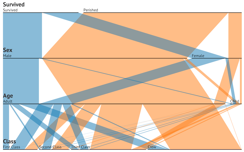
Immediately, parallel sets shows us the large numbers that perished in the Titanic’s sinking. Width reveals not only the breakdown or survivors/non-survivors, but also the composition of the ship’s passengers prior to hitting the iceberg. This additional data could only be calculated from the table by manually adding across separate tables, which again incurs a time cost.
Smart Visualization Over Stupid Hypothesis Testing
Imagine you’ve just written a nucleotide sequence processing algorithm and you want to make sure it isn’t being confounded by large sequences or small sequences. Some scientists reach for a hypothesis test. No! Visualize it. A hypothesis test is inherently univariate. Visualization is multidimensional. In this case, I would plot in two dimensions and color by sequence length. Or use density plots and color by sequence length. Then try a logarithmic scale. Try coloring by sequence length in continuous and discrete color scales.
Statisticians are obsessed by confounding variables, but I feel folks writing data processing scripts are not. The example above is what I call color-by-confounder (well, possible confounder). If a variable that should be unrelated to another is forming a colorful cluster in a scatterplot, visualization (and your pattern-finding ape-brain) is much more effective than a clumsily applied, assumption-ridden, old-fashioned, philosophically-troubled hypothesis test.
It’s worth mentioning that while our ape-brains are indeed excellent visual pattern finding machines, they can also be prone to false positives. Getting in the habit of forming hypotheses about how a graphic should look before creating it can help protect us from apophenia. I’ve seen strange patterns emerge in data that scream, “you screwed something up big”, but after heavy thought reveal everything is fine.
Build Tools that Support Visual Output
Developers should try to output data in file formats that are very easily parsed by existing functions or libraries in popular languages. It’s indefensible to make up a file format when your data can be equally well expressed in an existing one. Most data can be expressed in tab-delimited, CSV, JSON, or XML. It takes two lines in R to load any of these file formats with the appropriate library; there is virtually no barrier to loading and visualizing data from these formats.
Recently I had to process some variable-space tabular output from a popular bioinformatics program. The manual had a footnote saying, “contrary to the shrieks of outrage we occasionally receive about this, space-delimited files are just as trivial to parse as tab-delimited files.” Considering the header was across two rows (seriously), data can contain spaces (and is not quoted), and the delimiters could have as few as one space, this is most definitely not safely trivial across datasets.
Attempting to use a human-readable format such as variable-spaced/fixed-width-column formats makes the rather silly assumption that your data will only be looked at by a human. It’s always easier to make human readable data out of computer-readable data than to do the opposite. In today’s big data age, I’m skeptical humans actually process huge data sets in human-readable file formats in any way that’s both meaningful and not horribly inefficient.
Ok, How do I Learn Visualization?
The first requirement to be able to visualize quickly is to know your tools. R is unequivocally the best tool to learn first, and learn the best. Buy Hadley Wickham’s ggplot2 book, and bookmark his website. Learn ggplot2 thoroughly; it scales almost impossibly well to the complexity of problems you throw at it (primarily because it’s built around an ingenious abstraction).
Edward Tufte also has some excellent books on visualization worth investing in. The Visual Display of Quantitative Visualization is probably the best to start with. Other excellent projects worth being aware of are:
Color Brewer for intelligent color choices for different problems.
d3.js is a new-ish Javascript visualization framework I am very excited about.
ggobi is a useful system for high-dimension visualization.
lattice was the first graphics package for R I learned, and even though I use ggplot2 primarily now, it is still useful.
ggbio if you do bioinformatics. Learning to use genome browsers, track formats (BED, WIG, GTF), and read visualization programs (such as IGV) are also very important skills.
Generally, the best advice about learning visualization is to be patient, and not settle for a subpar graphic. Patience and perfectionism will lead to better graphics and a thorough understanding of the tools.
Conclusion
Visualization is a skill worth investing time in. It’s a low hanging fruit for all programmers. It’s also enjoyable. Fundamentally, developers need to adjust how they think about visualization. It’s not something to brush up on every time a plot is needed for an article or presentation. It should become part of every professional developer’s workflow, right alongside version control, debugging, and unit tests.